
menu
|
|
Warning: session_start(): Cannot send session cookie - headers already sent by (output started at C:\domains\STP100152\theharlowreport.com\wwwroot\2015\article_2015.php:152) in C:\domains\STP100152\theharlowreport.com\wwwroot\2015\article_2015.php on line 247
Warning: session_start(): Cannot send session cache limiter - headers already sent (output started at C:\domains\STP100152\theharlowreport.com\wwwroot\2015\article_2015.php:152) in C:\domains\STP100152\theharlowreport.com\wwwroot\2015\article_2015.php on line 247
(Printer Friendly Version)
first published week of: 10/05/2015
Are Map Legends Too Lazy?
by alasdair rae
A somewhat click-baity blog title, but I wanted to crowdsource some knowledge from proper carto/viz people, so if you have any insights on what I write, please feel free to get in touch via twitter or e-mail. No doubt what I write about below already has a name but I don't know what that is and I haven't seen this functionality in proprietary or open source GIS. By asking 'are map legends too lazy', what I really mean is are GIS-made choropleth map legends doing enough for us in their current form - and is there an opportunity for us to add some new functionality which enhances the communicative power of the humble choropleth legend? An example... look at the map below, which I created in QGIS. It's a map of a new deprivation* dataset for England, focused on the local authority of Birmingham.
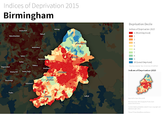 Deprivation choropleth, with legend and inset map
This dataset is typically understood and discussed in terms of deciles, hence the classification used above. The dataset goes from decile 1 (most deprived) to decile 10 (least deprived) - within the context of England as a whole. Cities like Birmingham tend to have a higher proportion of their small areas in the most deprived decile, and in map form this results in lots of red and not much blue, as you can see above. If you wanted to find out how many areas were in decile 1 (most deprived) you would know that it was 'a lot' but because the inner-urban areas tend to be smaller in size (relative to the blue ones), making an accurate assessment visually is quite difficult. In fact, owing to the different sizes of the spatial units, you could quite easily take the wrong message away from a choropleth like this. continued…

Volume 37
GIS News Snippets Industry Notes
In Government
In Technology
FAA Releases Drone Registration Rules


Save 10%
Use Code STASH


 RSS
RSS

GAF AG selected as the European Earth Observat...
Government Agencies Spent $4.4 Billion On Self...
White House CTO: Government Needs Tech Industr...
In Technology
14 Ways IoT Will Change Big Data And Business For...
Salesforce And Box Join Forces To Ease File Acces...
When A Single E-Mail Gives Hackers Full Access To...
FAA Releases Drone Registration Rules
GE Expands Wind Portfolio with Introduction of Ne...
State's Revamped Trash-To-Energy Plant Faces Fall...
GE Expands Wind Portfolio with Introduction of Ne...
State's Revamped Trash-To-Energy Plant Faces Fall...
Custom Search
Save 10%
Use Code STASH
RSS
 ♦
♦ 
- Adidas YZY HU
- Reebok Instapump Fury OG
- Lebron 13 Elite
- Adidas Ultra Boost Uncaged
- Nike Espańa
- Melo M12 Basketball Shoes
- Official Adidas Yeezy Boost 350 V2
- Nike Shox Webáruház
- Nike Stefan Janoski Max ár
- Scarpe nike hypervenom II AC
- Acquista Jordan 13
- ZAPATILLAS DE TENIS
- Nike Magista Obra II FG Fußballschuh
- Nike Air Presto Essential
- Nike Chaussure Air Rift
- NIKE AIR VAPORMAX HERREN
- Adidas Gazelle Femme Homme
- Jordan Super.Fly Eladó
- Curry 2
- Amazon adidas NEO
- Golden Goose Deluxe Brand For Women
- Acheter Adidas Yeezy Boost 350v2
- Chaussure Nike Kobe 12
- Nike Roshe Run EN Ligne
- Billiga Adidas X Soccer Cleats
- Nike Air Max 2015
- Nike Cipo Webshop
- Nike Dunk Sky High Eladó
- Nike Scarpe outlet
- New Balance 574 Damen
- Chaussures de basket Nike Lebron 13
- Vente Kyrie 3 Pas Cher
- Olcsó Nike Air Rift Racer
- CESTA AIR JORDAN 13
- SCARPE Nike Air Force Mid
- Nike Sky High Revolution Skor
- Scarpe adidas Stan Smith
- Adidas Yeezy Pas Cher
- Air Max 90 Sportschuhe
- Scarpe da calcio Nike Mercurial Superfly V